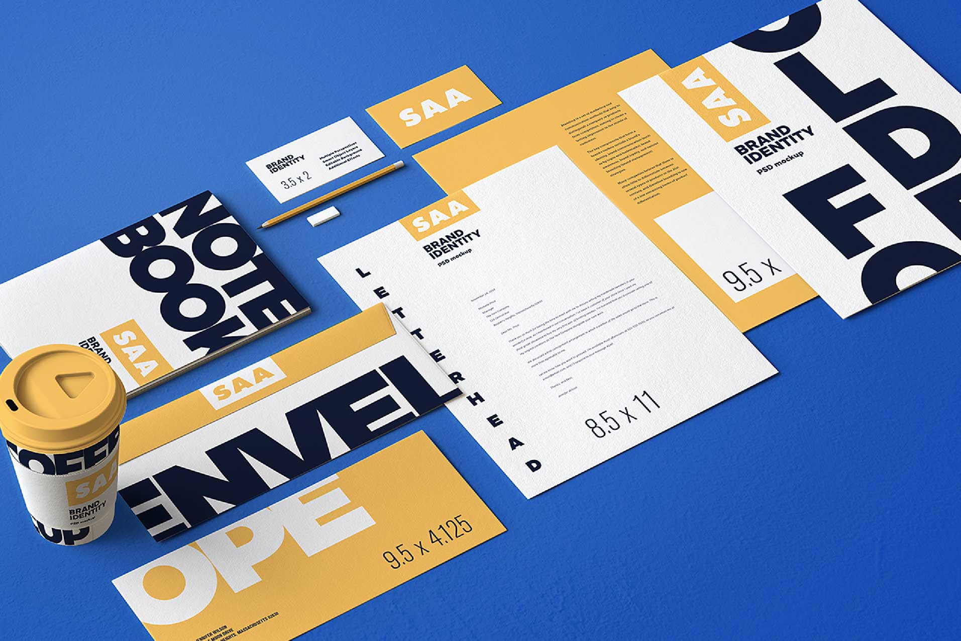
Further to one of our earlier Blogs on ‘Building a Smashable Brand’, we thought it would be worth sharing one of the key ingredients to help assist with that, along with the inclusions and importance of having a ‘Brand Guidelines’ document.
While we’re in the business of helping a range of companies build and maintain their brand identities, we work with a range of clients that have the need for an internal design resource to put together their smaller day to day needs. They might also have external print or manufacturing needs that require a level of design input from the suppliers, and in order to reign in any creative freedoms or to explain the nuances of their brand to the uninitiated, a brand guidelines document or style guide can be invaluable.
Brand Guidelines are set up to explain the basic rules of what can and can’t be done when communicating anything and everything that comes from your companies visual or verbal voicebox, and usually cover off the following items…
Logo Rules: As the fundamental part of your brand, your logo always needs to be presented in its best light, so there should be rules around giving it some clear space to breath i.e: not having anything too close to it, it’s minimum usage size and how it should be used in full CMYK colour, greyscale and monochrome.
Colour Palette: All well produced brand identities should come with a stringent colour palette which illustrates the Primary Palette, being the range of colours that are used predominantly and quite often a Secondary Palette, which allows for a broader expression while remaining complimentary to the Primary Palette. Guidelines should also illustrate exactly how and where they should be used, along with their respective CMYK breakdowns and Pantone numbers for those occasions when printing in spot colours.
Type / Font Styles: There’s nothing quite as unattractive as seeing a piece of communication with a wide variety of fonts used. Not unlike the rule around colour palettes, we recommend applying a Primary Font for use in headlines where impact is required and a Secondary Font for body copy where maximum legibility is required. Guidelines are used to illustrate not just the basic fonts, but also the various weights or styles within the ‘font family’ that are allowed without diverting from the course.
Image Direction: Photography or illustration is always heavily used to make an emotional connection, and a consistent style can be applied to help build brand continuity. There might be some exceptions from time to time for specific campaign requirements, but there’s no doubt that imagery plays an important role in building a brands visual language, so it’s important to share some examples of how subjects should be lit or framed, and of course, how not to.
Tone of Voice: We put as much emphasis on a brand verbal language as we do its visual language. Whether your brand speaks with a voice of authority or reason, slightly whimsically or uses humour, the tone in which a brand communicates with its audience needs to be consistent at every turn and reflect the same personality, and a brand guidelines document needs to share some examples of that.
Without guidelines like these, you’re basically leaving the door open for your brand to go off the rails when placing it in to the hands of a new supplier or perhaps even a new staff member, and nobody wants that.
If you need some guidance or advice on how to make the best of a bad situation from a marketing point of view, feel free to give us a call on (02) 4231 4345, as we’d welcome an opportunity to be of some help.
Other Blogs
What’s in a name
The answer to the question in the title of this piece is of course…, plenty! It’s fair to say that...
Developing a Good Brief
In our game, there’s nothing more important than a good brief from a client. It’s the initial step...
Social Media Advertising
We’re all familiar with the idea of posting on Social Media. Whether it be Facebook or Instagram,...


