
Maeva Hospitality
Brand Strategy | Brand Identity | Website | Print
One of the leading hospitality groups on the coast is Sunshine Coast Hotels. With 3 pubs already in operation, another launching this year, a prominent function venue and string of bottle shops, there’s little doubt Sunshine Coast Hotels have a considerable presence on the coast.
Their biggest issue however, was their name as none of the current venues offered accommodation, and when someone tries to find them through a search engine like Google, you can imagine how many accommodation providers pop up due to the word ‘Hotel’ being in their name.
So, while they motivated by name change, it was also a good time to take stock of where they were as a group, reflect on where they started and determine where they might be in five years time. More often than not, a big conversation like that can often be helped by having an independent third party who’ll bring some objectivity while facilitating the discussion. Someone who doesn’t necessarily work ‘in’ the business, but someone who can work ‘on’ it and help the stakeholders involved in the day to day to do the same – and that’s where we came in.
As always, the half day workshop session proved very insightful, for all involved, and the written report with the findings greatly helped clarify a range of issues for the SCH team, and provided some solid insight to inform the creative brief.
With the theme of ‘Elevated Community Hospitality’ at the core of the brand, the owners of the business decided to rename the company ‘Maeva Hospitality’. Maeva is actually the French Tahitian word for ‘Welcome’ which is exactly how they wanted their customer base to feel in any of their venues.
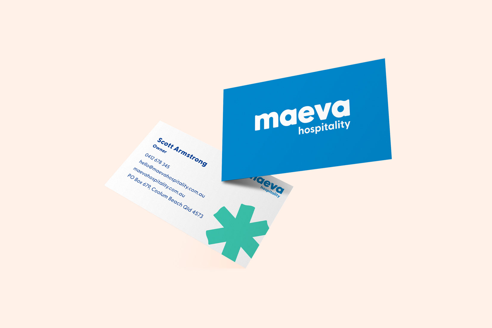
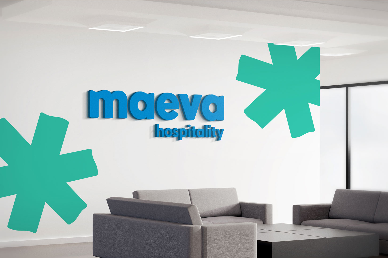
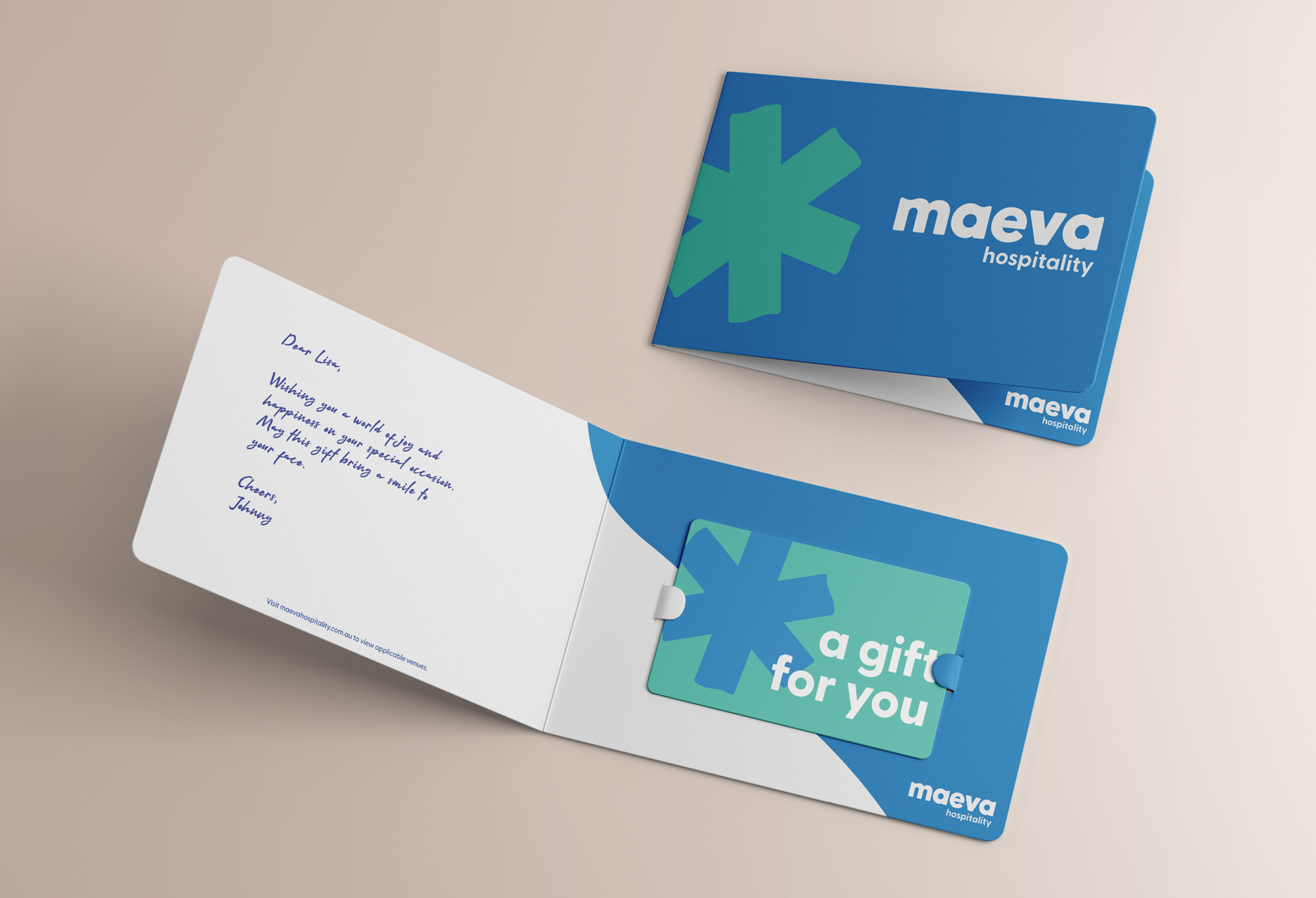
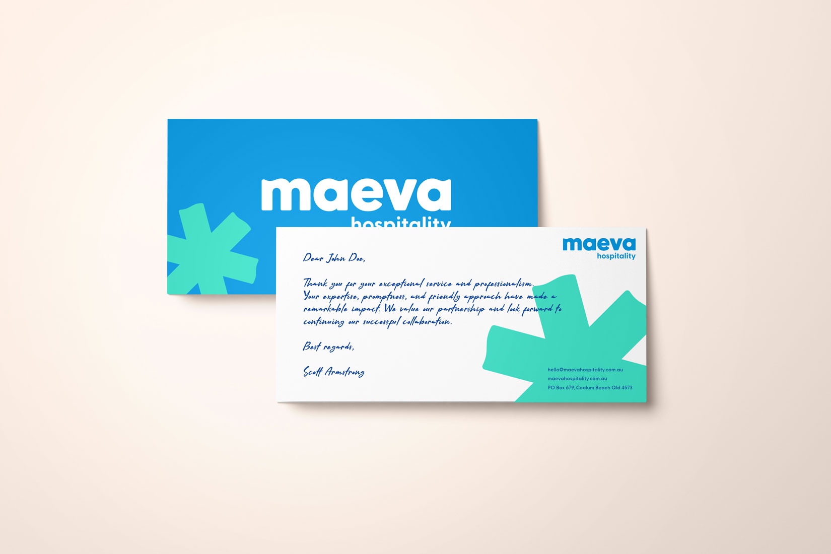
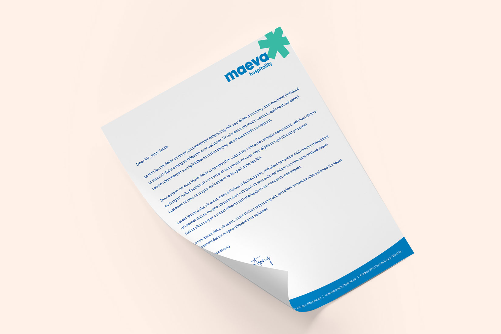
With a name now in hand, we were then able to get to work on developing the new identity. The nature and meaning of the word Maeva led us to a lower case logo type that was solid in it’s line weight, illustrating the strength of the business, but with soft curves throughout the letters to help illustrate the friendly and approachable way they like to do business.
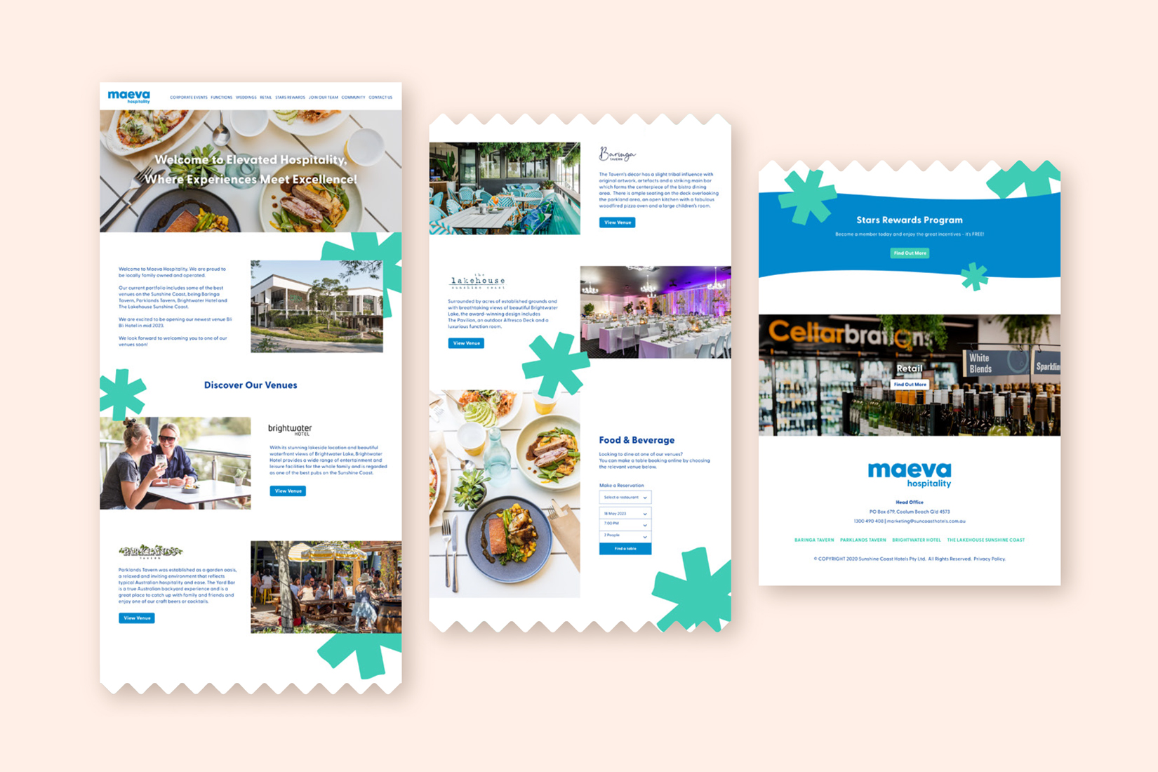
While gentle wave like curves were added to the font, we took cues for our colour choices from Tahitian flowers coupled coastal blues and greens.
The September launch will see the new Maeva brand appear throughout all of their venues more prominently than the old brand was used, but heralds a new beginning, or perhaps more a fresh start for one of Sunny Coasts much loved hospitality groups!
