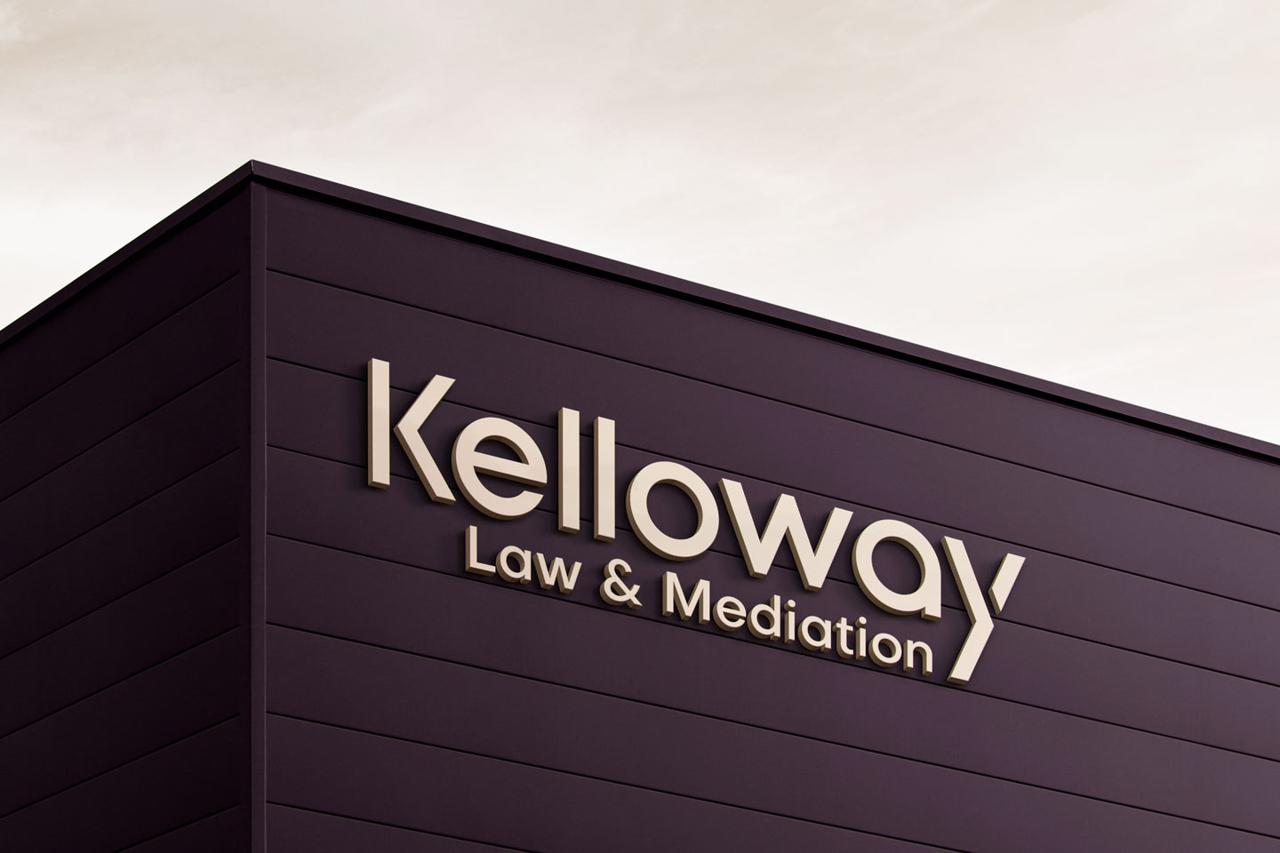

Kelloway Law & Mediation
Brand Identity | Brand Strategy | Print
Kelloway Law is a new entrant on the Illawarra’s legal landscape who specialise in the tricky art of mediation, and they approached Flying Pigs Creative to assist with building their Brand Identity.
With two distinctly different audiences to appeal to, as far as the direct public and other law firms who would refer business their way, the brand needed to appear both approachable and down to earth, while retaining a business like, minimalist corporate flavour.
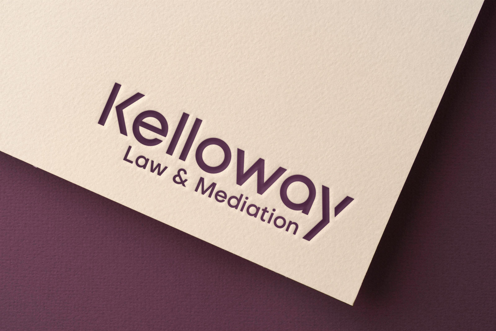
As most would agree, law firms can often appear a little stuffy and the old cliché’s of books, gavels, columns and wigs all spring to mind, so our approach to Kelloway’s was simply built around an elegant, sans serif logo type for the master brand mark.
Interestingly, while exploring the shapes of the ‘K’ and the ‘y’ letters in the logo, we discovered the symbols of positive and negative arrow forms in the inversion of the letters that we could use as a graphic language supporting device across the materials.
It was also important that we use a gender neutral colour palette, as there would inevitably be times where Kelloway may need to represent either males or females in delicate discussions, and appearing to have a leaning either way may not have been good for business.
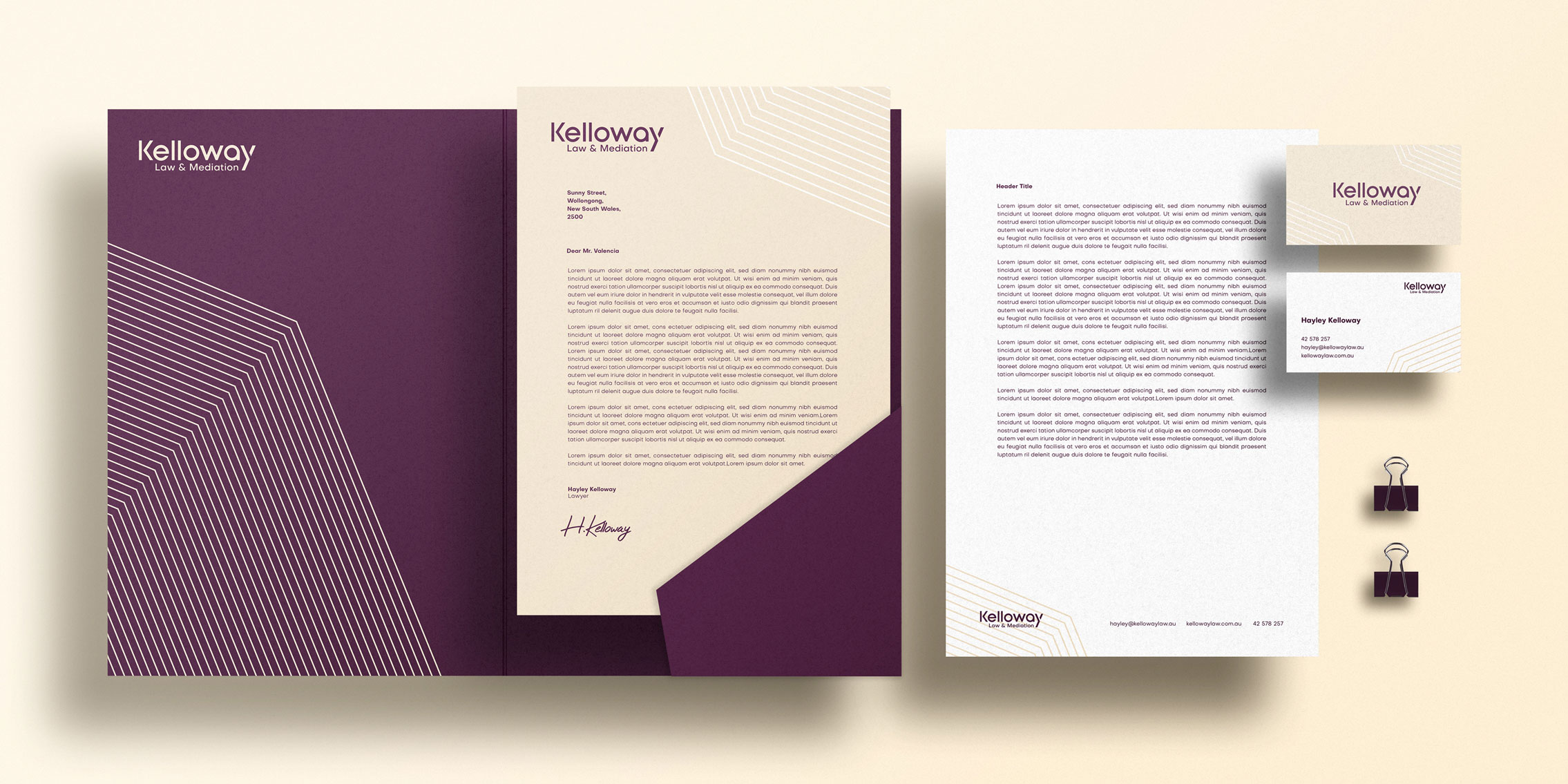
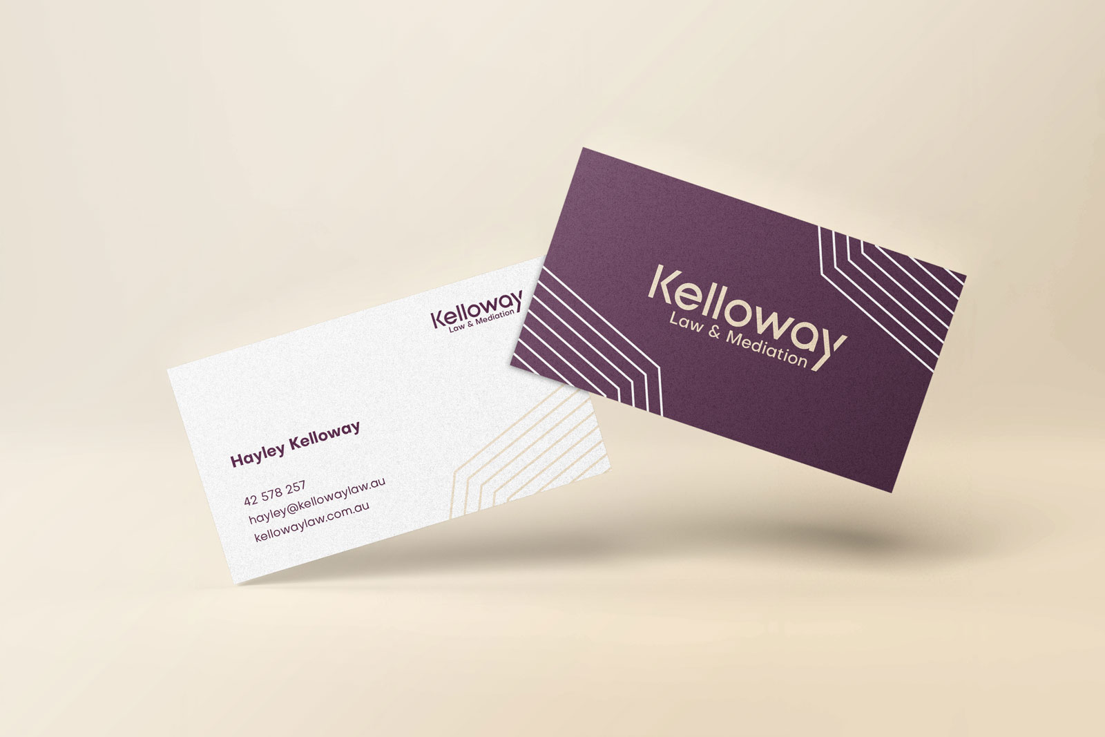
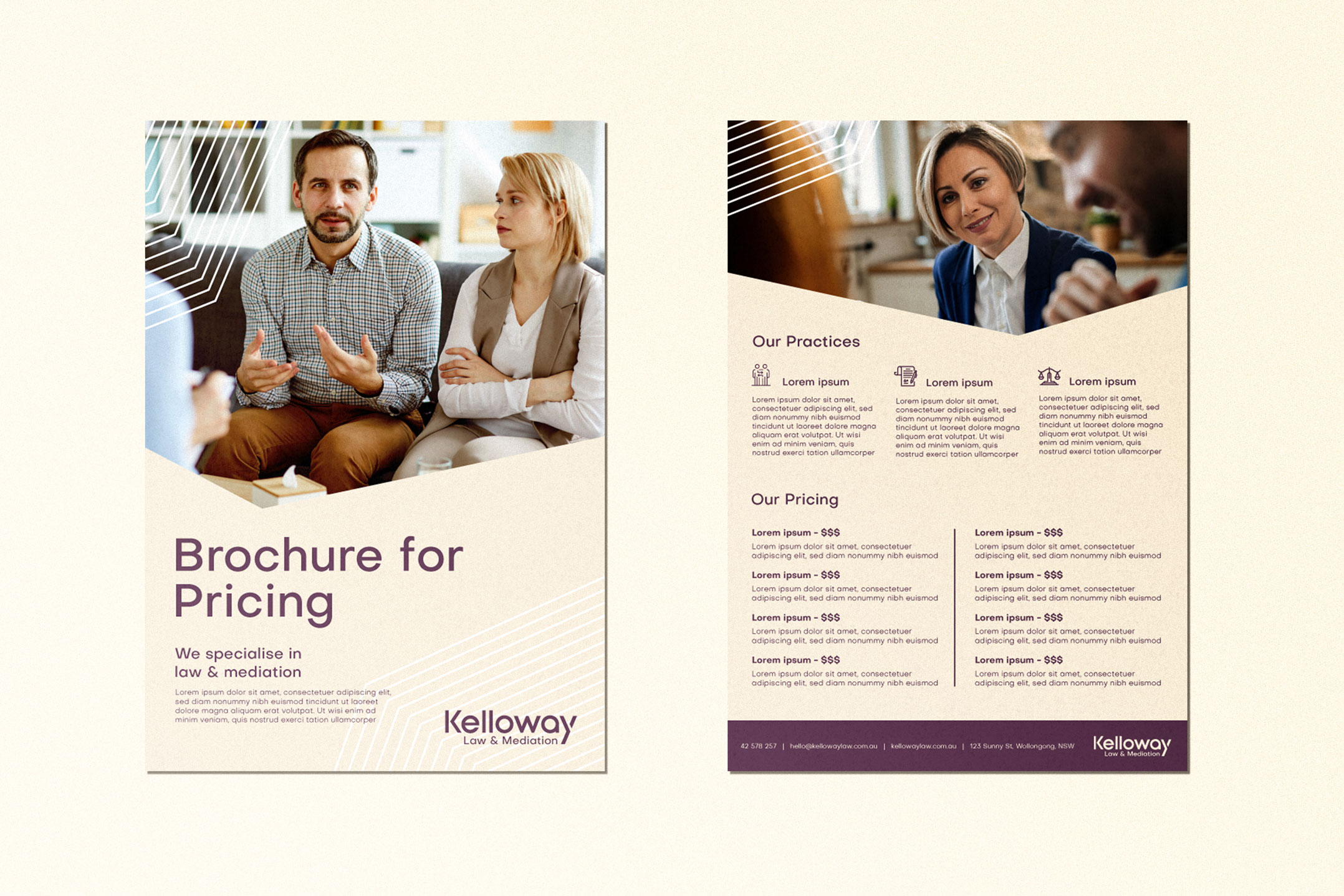
Given the start up nature of the business, we didn’t need to apply the brand to a deep range of tools, but all the essentials needed to be done, which in this case was the mandatory stationery package, a presentation folder, price guide brochure and a well considered, thorough visual style guide for the website.
With those tools now in hand, Kelloway Law are now dressed for success!
