Elite Muscle Therapy
Brand Strategy | Brand Identity | Print | Signage | Advertising | Copywriting
A local Wollongong based massage therapist was keen to reinvent his business in an effort to elevate the appearance of his brand and appear more like a premium offering. His practice was based in the convenient position of being housed within a popular fitness gym, which in turn meant that there could be a dedicated customer base right on his door step.
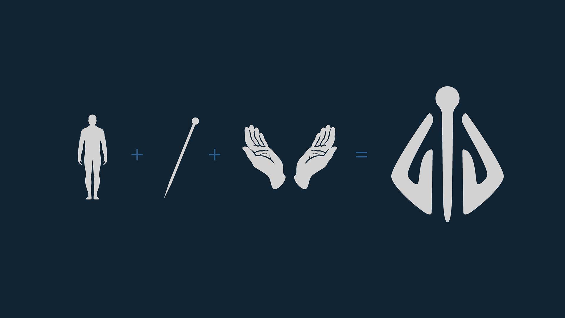
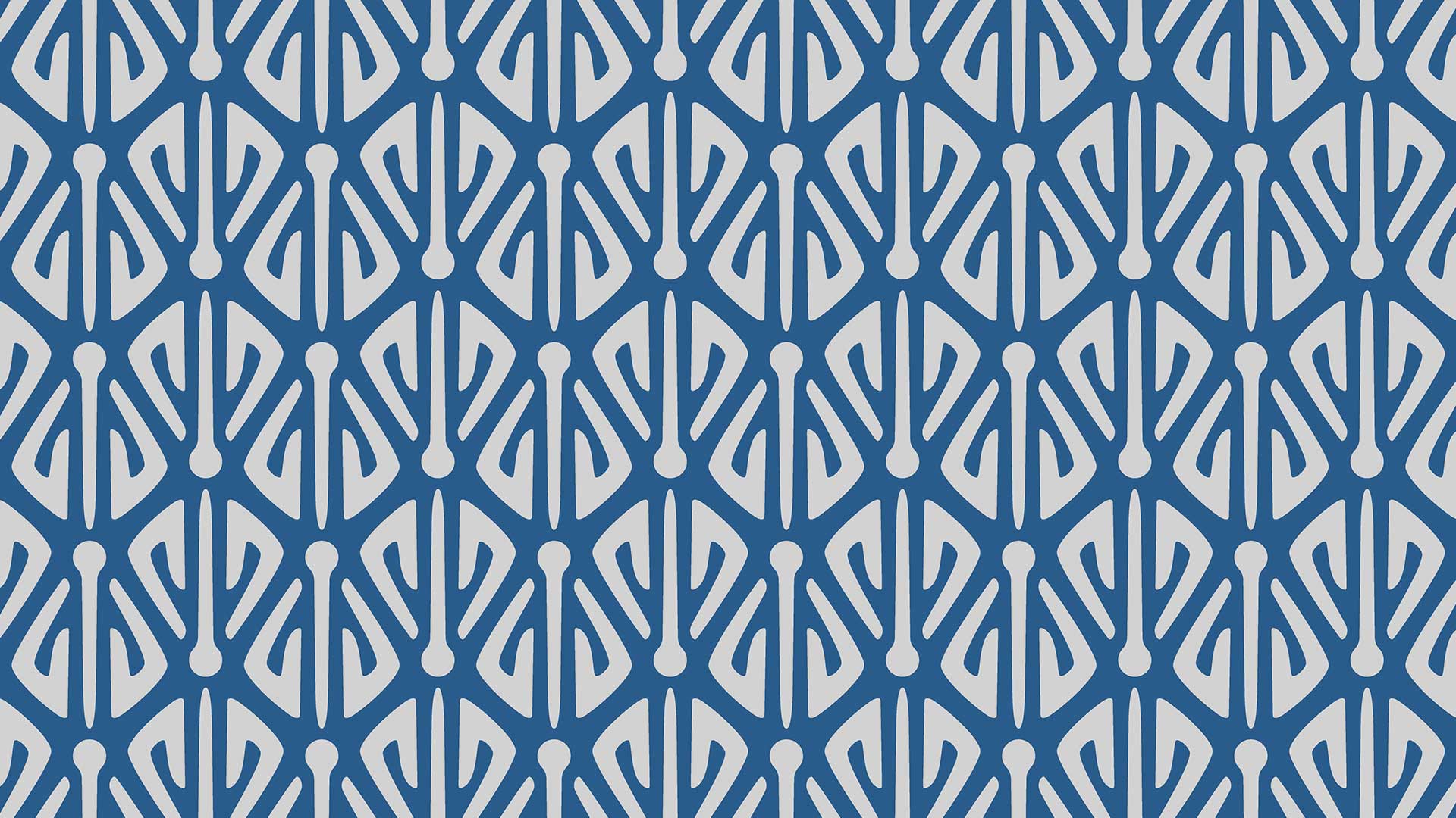
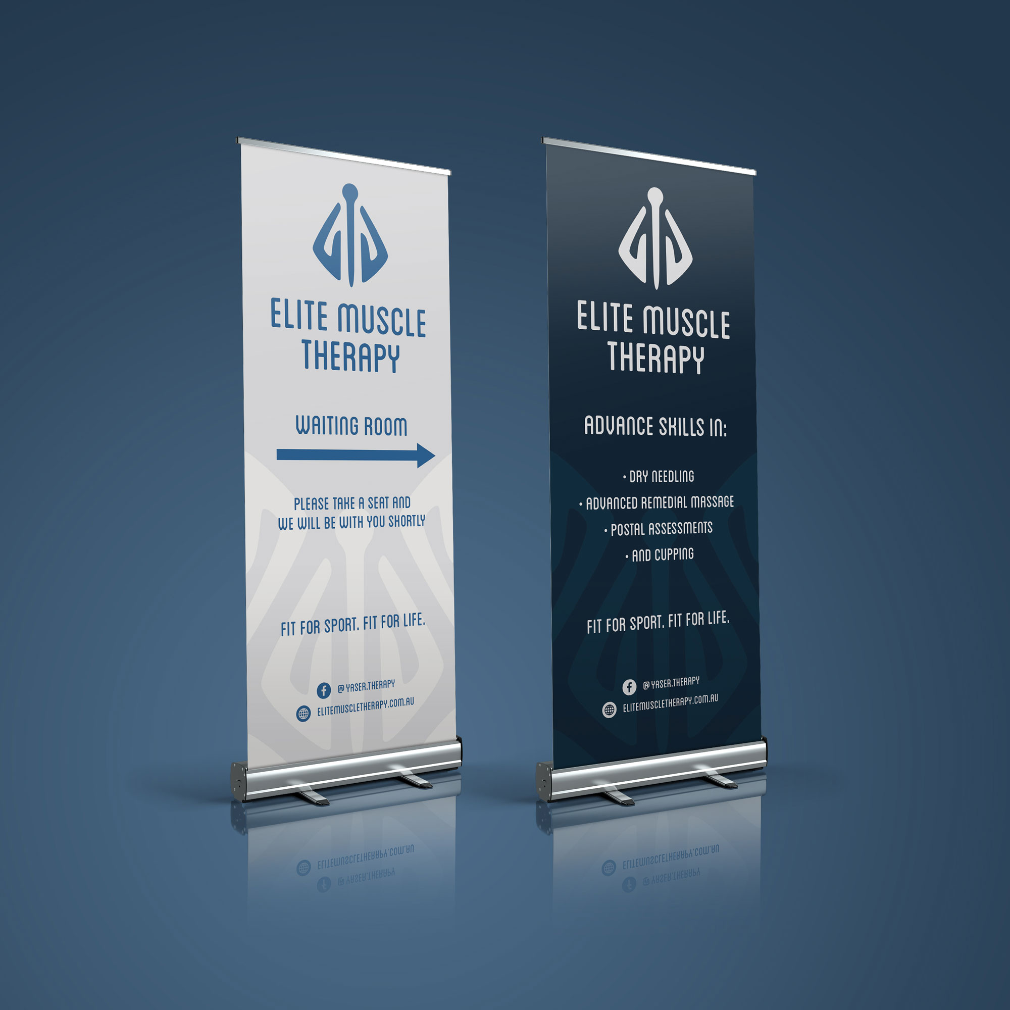
To develop the master brand logo device, we created a stylised representation of the human form and the needles used in dry needling therapy, coupled with a pair of hands that represent the nurturing and human care that EMT provides. The device also worked beautifully when used as a graphic language or pattern suitable for wall graphics or other applications.
The logo device was then coupled with a geometric sans serif typeface which conveyed the qualities of minimalism and modernity while keeping it on brief by way of approachability, appearing slightly clinical and premium in nature.
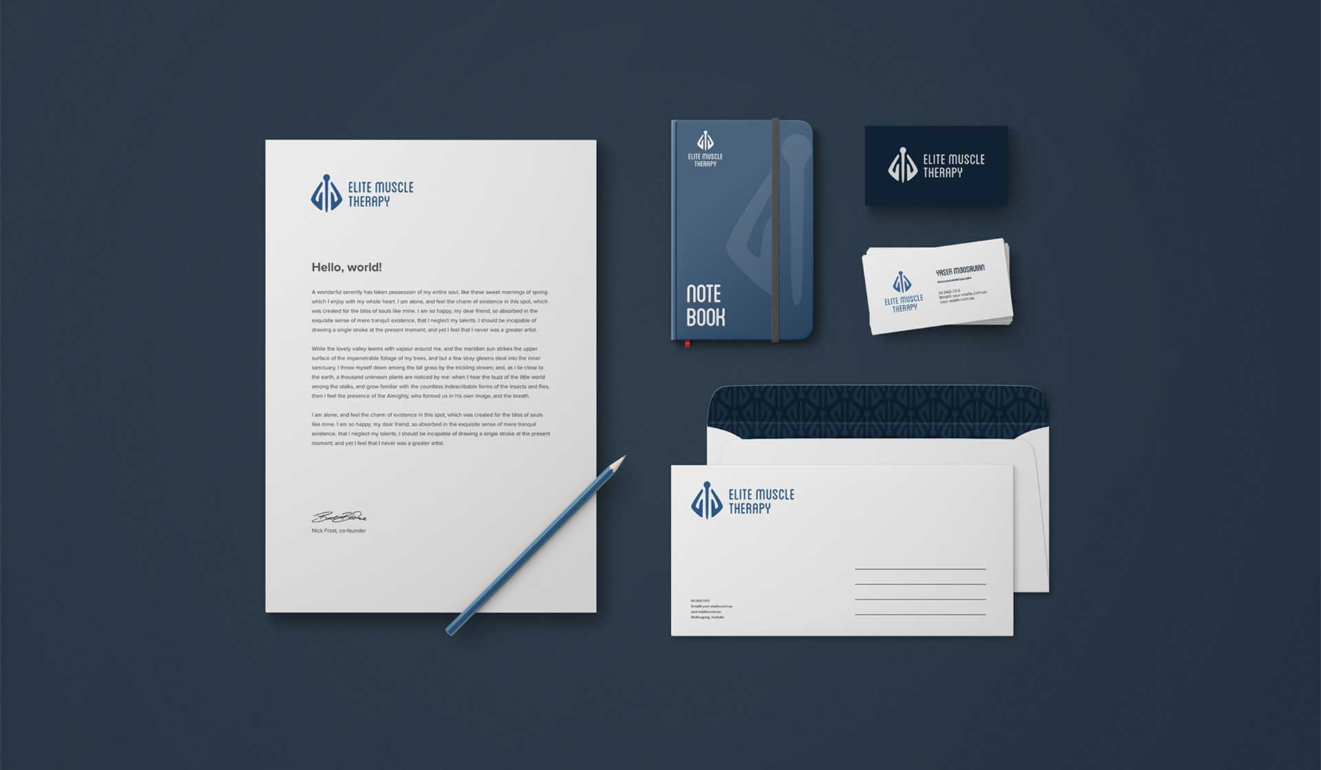
Where possible in print, the logo could be printed using a metallic silver ink to further elevate the premium feel of the brand.
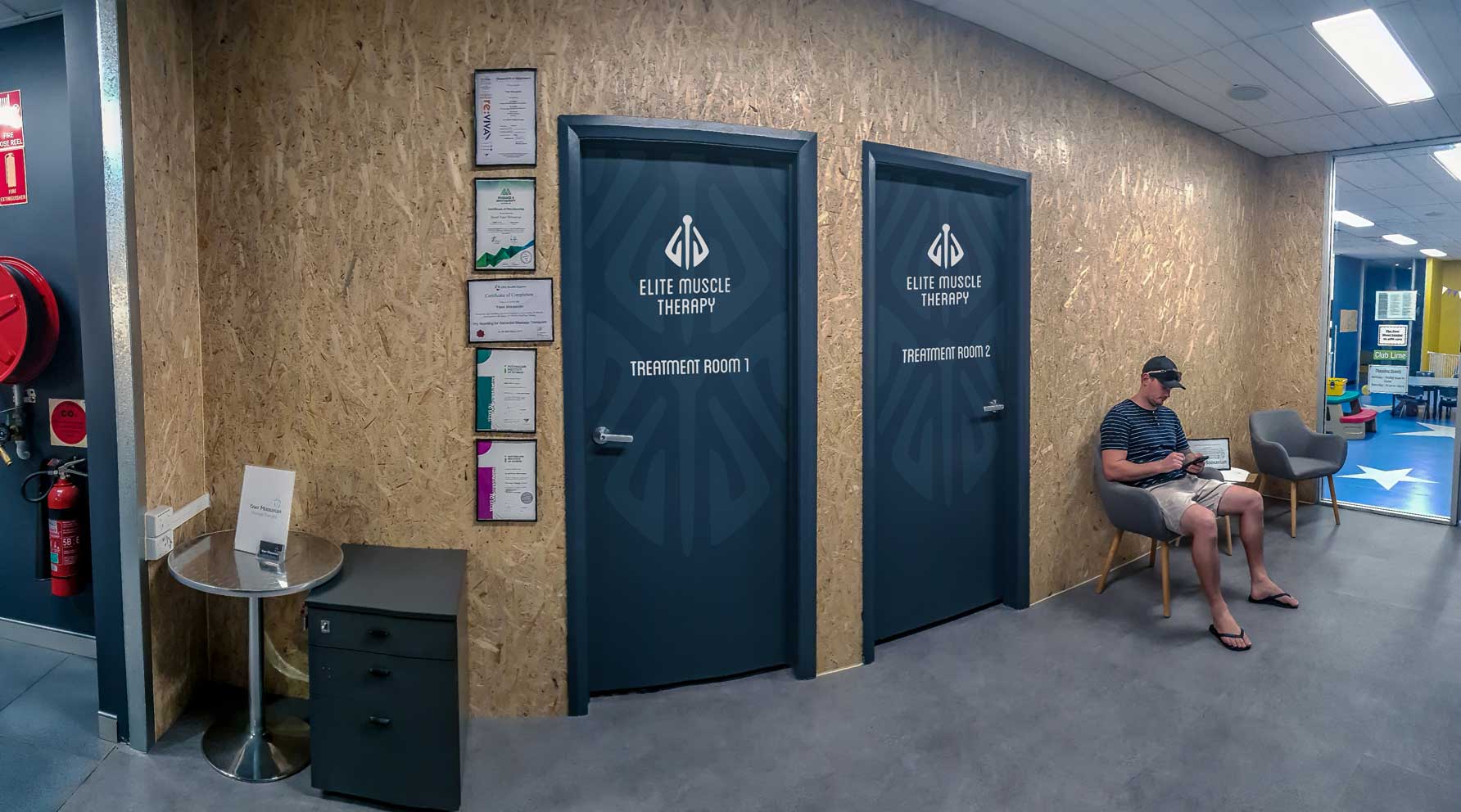
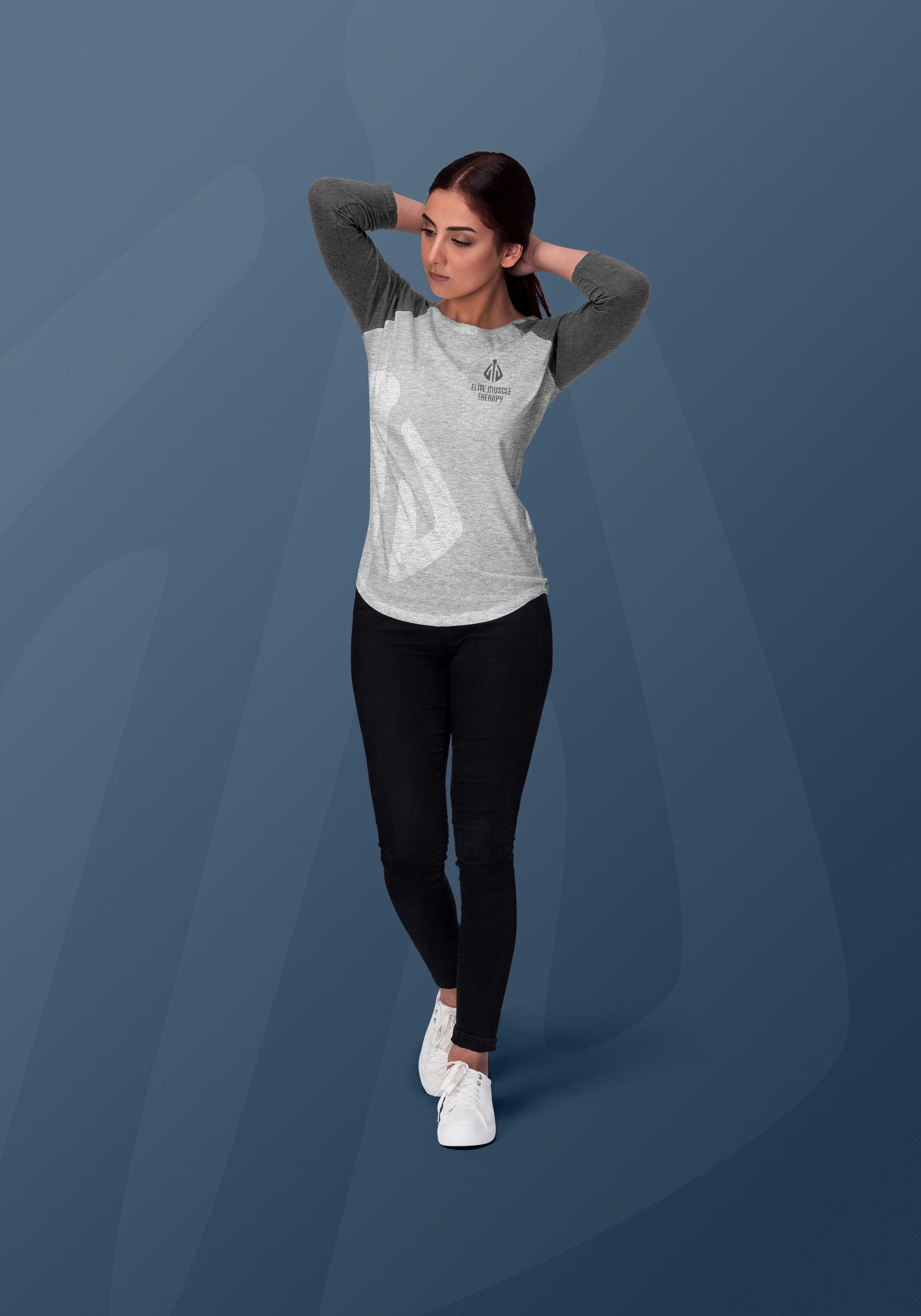
As a starting point, the assets were finally applied to stationery, apparel, environmental graphics and way finding signage around the practice to inform their clients of their location within the premises.
Elite Muscle Therapy
Brand Strategy | Brand Identity | Print | Signage | Advertising | Copywriting
A local Wollongong based massage therapist was keen to reinvent his business in an effort to elevate the appearance of his brand and appear more like a premium offering. His practice was based in the convenient position of being housed within a popular fitness gym, which in turn meant that there could be a dedicated customer base right on his door step.
To develop the master brand logo device, we created a stylised representation of the human form and the needles used in dry needling therapy, coupled with a pair of hands that represent the nurturing and human care that EMT provides. The device also worked beautifully when used as a graphic language or pattern suitable for wall graphics or other applications.
The logo device was then coupled with a geometric sans serif typeface which conveyed the qualities of minimalism and modernity while keeping it on brief by way of approachability, appearing slightly clinical and premium in nature.
Where possible in print, the logo could be printed using a metallic silver ink to further elevate the premium feel of the brand.
As a starting point, the assets were finally applied to stationery, apparel, environmental graphics and way finding signage around the practice to inform their clients of their location within the premises.

Other Work
Other Work